Financing Optimizations
Company: Instamotor
Description: Quick-fire iterative improvements
Post-Launch Plan
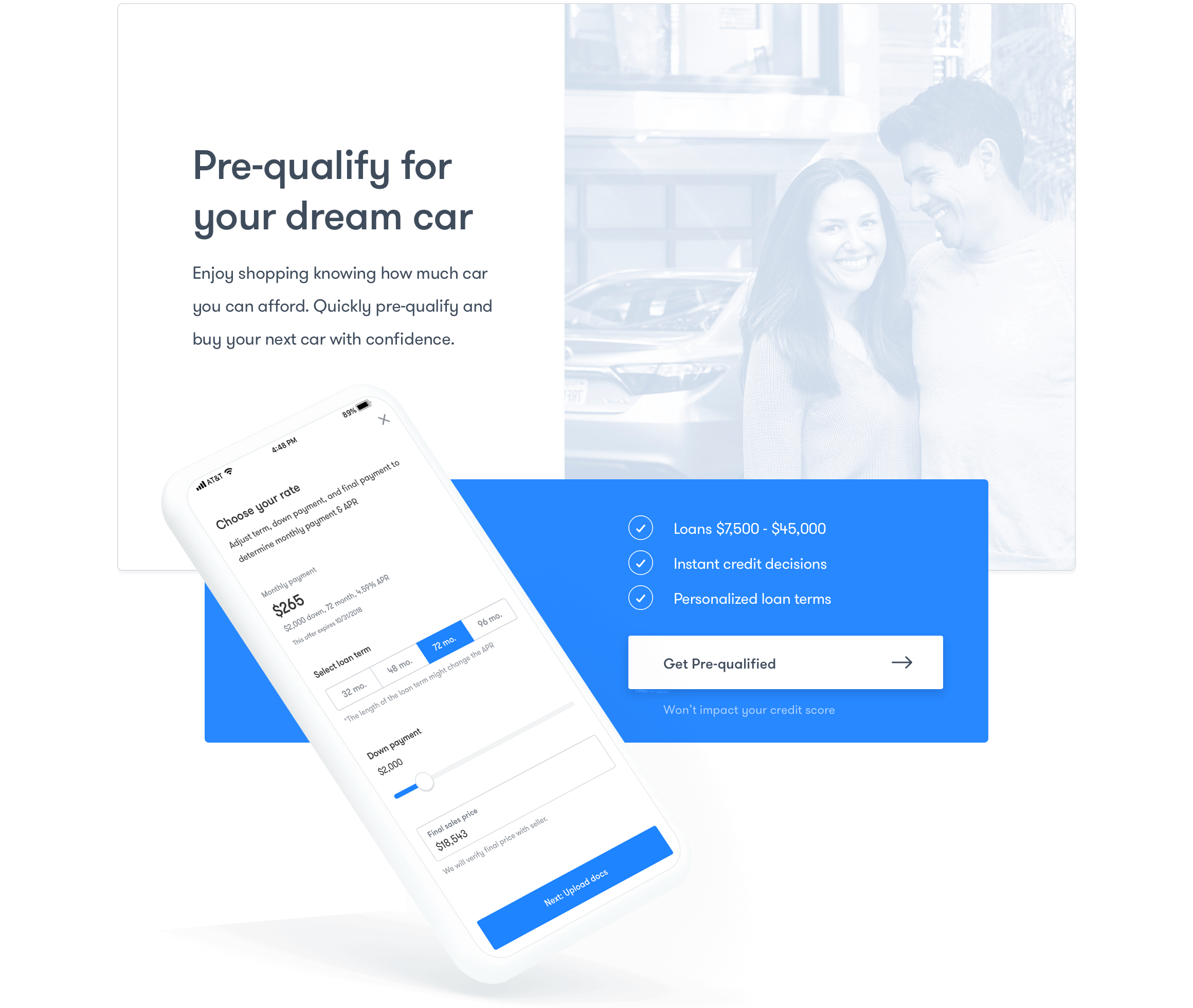
Working with financial partners has its fair share of variables, which made it a bit tricky on us mid-process. But with that said, our V.1 financing product was live and it was time to examine our initial metrics and iterate.
After parsing through early top of the funnel numbers, our head of product distilled the data and highlighted two issues to investigate:
- Low number of applicants
- Low application completion rate
Taking a closer look
Primed with our high-level goals, we dug further into our product metrics:

- Which current entry points performed well?
- What actionable insights can be pulled from our ‘buyer’ funnel metrics

- What steps in the financing application were people dropping off at?
- Were there any specific questions people were getting hung on?
Understanding our users
The numbers/data above only told one-half of the story, we needed to understand “why” and were there any other things we haven’t considered. For this we interviewed users and ran a few scrappy usability tests to get an idea of what made sense/what didn’t, were there any specific difficulties they ran into, etc.
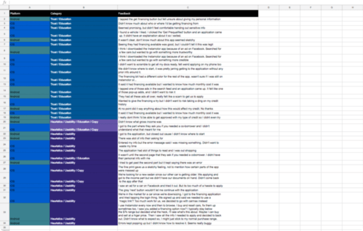
USER FEEDBACK & USABILITY NOTES
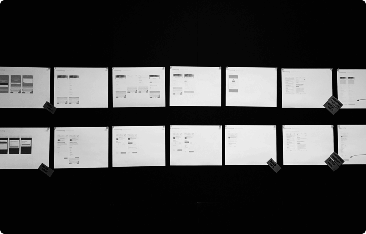
Collecting and sorting insights/feedback

Entry Point Adjustments
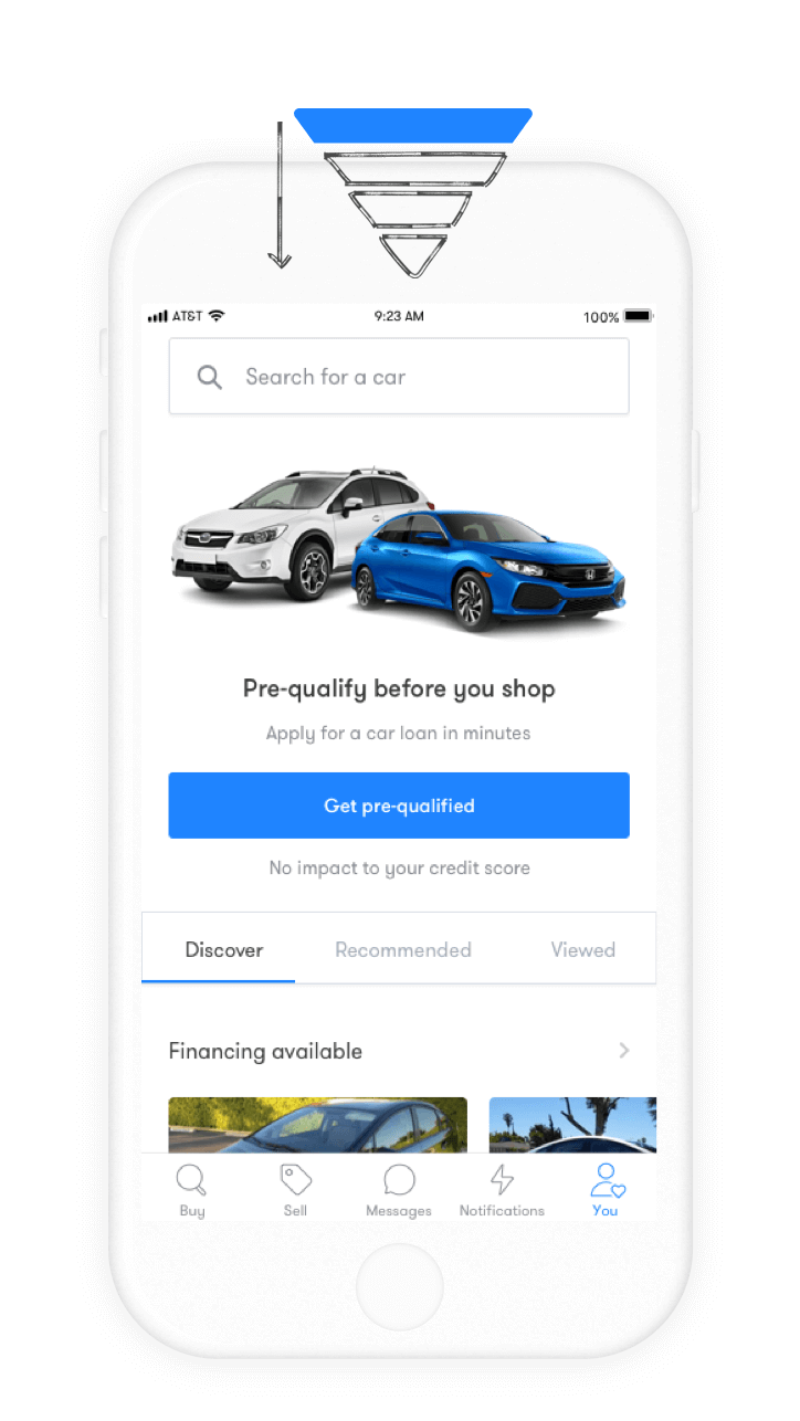
One of the more obvious fixes to a low initial number of applicants was increasing visibility and targeting the top of the ‘buyer’ funnel (where, of course, the highest number of users were). In our case, the marketplace entry— nice.
However, this only solved for vanity metrics. You can superficially influence volume, but driving users with intent is what’s really important here. One interviewee noted: "I'll browse sometimes, but I just want to take a look around."
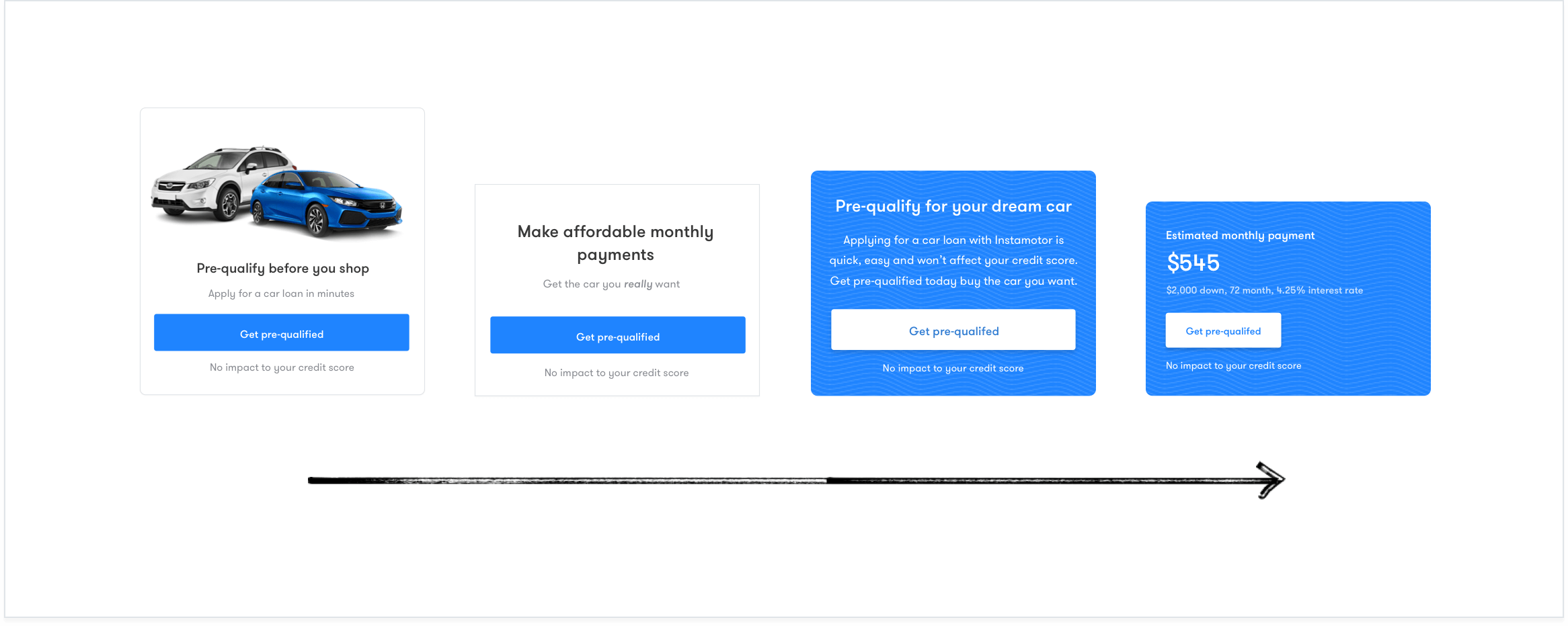
Mapping the 'buyer' journey
Driving users with intent, although, was a multifaceted problem (customer acquisition, demo, supply, seasonality, etc.) and couldn’t be solved with a silver bullet. Instead, we operated within the constraints of the project and focused on what we could affect through copy and design.
We zoomed out and took a high-level view of the ‘buyer’ path, and with the help of our content writer, drafted messaging that progressively became more detailed and granular depending on where the individual was in the product. Doing so, we were at least able provide information that was more relevant and useful as people shopped.
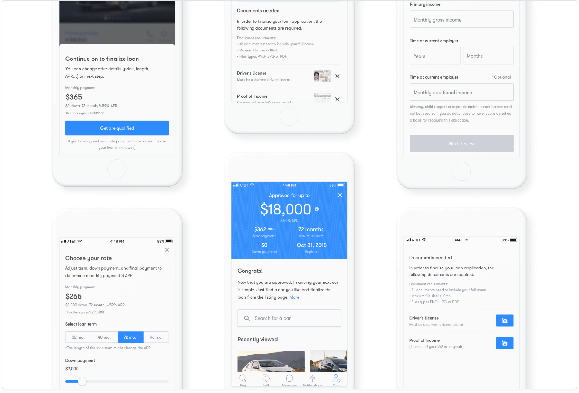
Application Enhancements
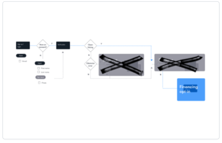
USER FLOWS
Investigating at a high-level
APPLICATION FLOW
Design team review and audit
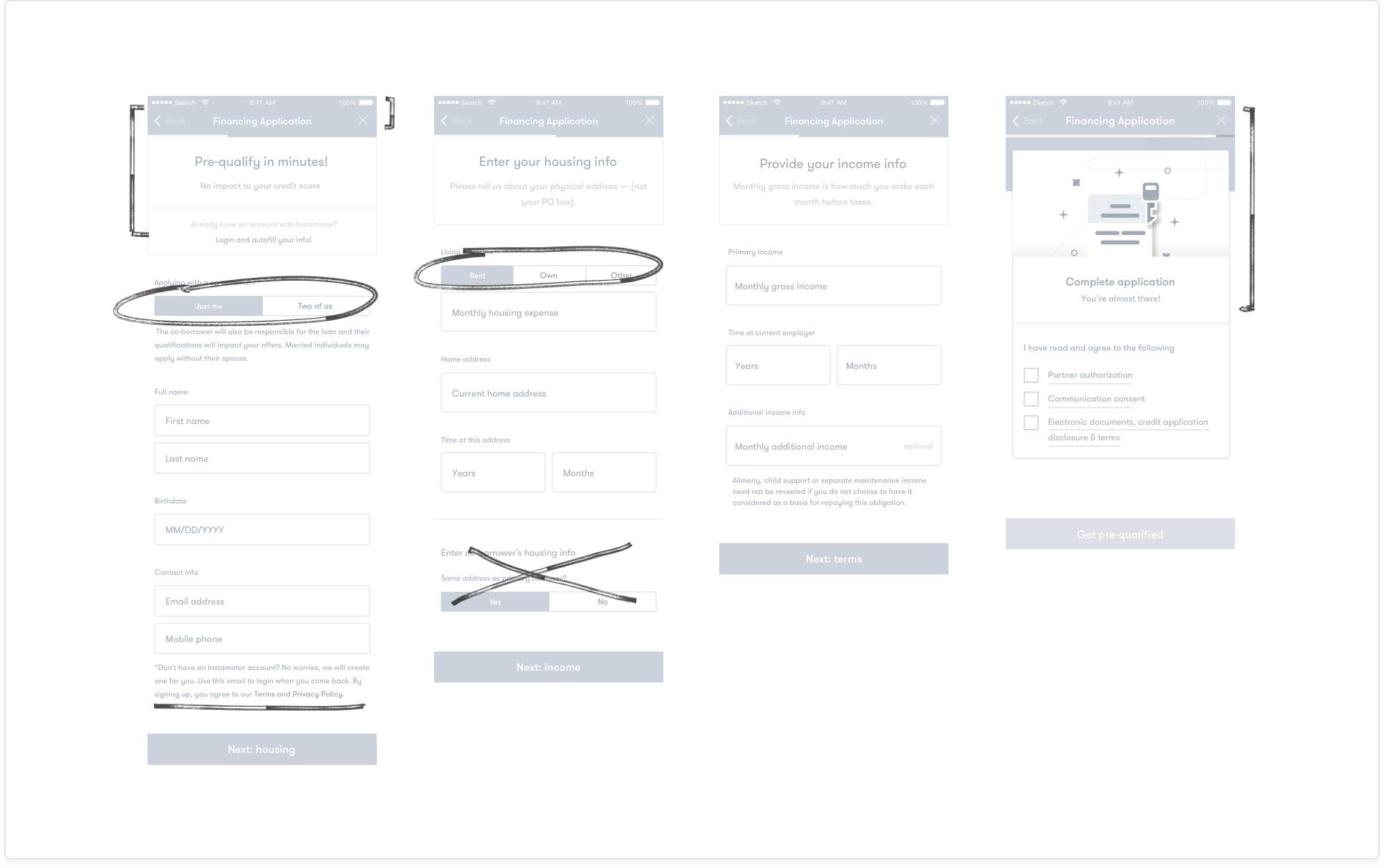
Assorted fixes
At this point, we gathered insights from metrics/user interviews + testing and prioritized based on frequency, level of difficulty, and rough estimates for implementation.
- Removed unneccessary info
- Stripped UI of visual noise (let the content lead)
- Used color-blocking to anchor instructional messaging
- General improvements to info hierarchy
- Re-routed certain forms/inputs to the other parts of application
- Replaced certain input UI with more common and familar components
- Refined copy to be more simple, human, and understandable
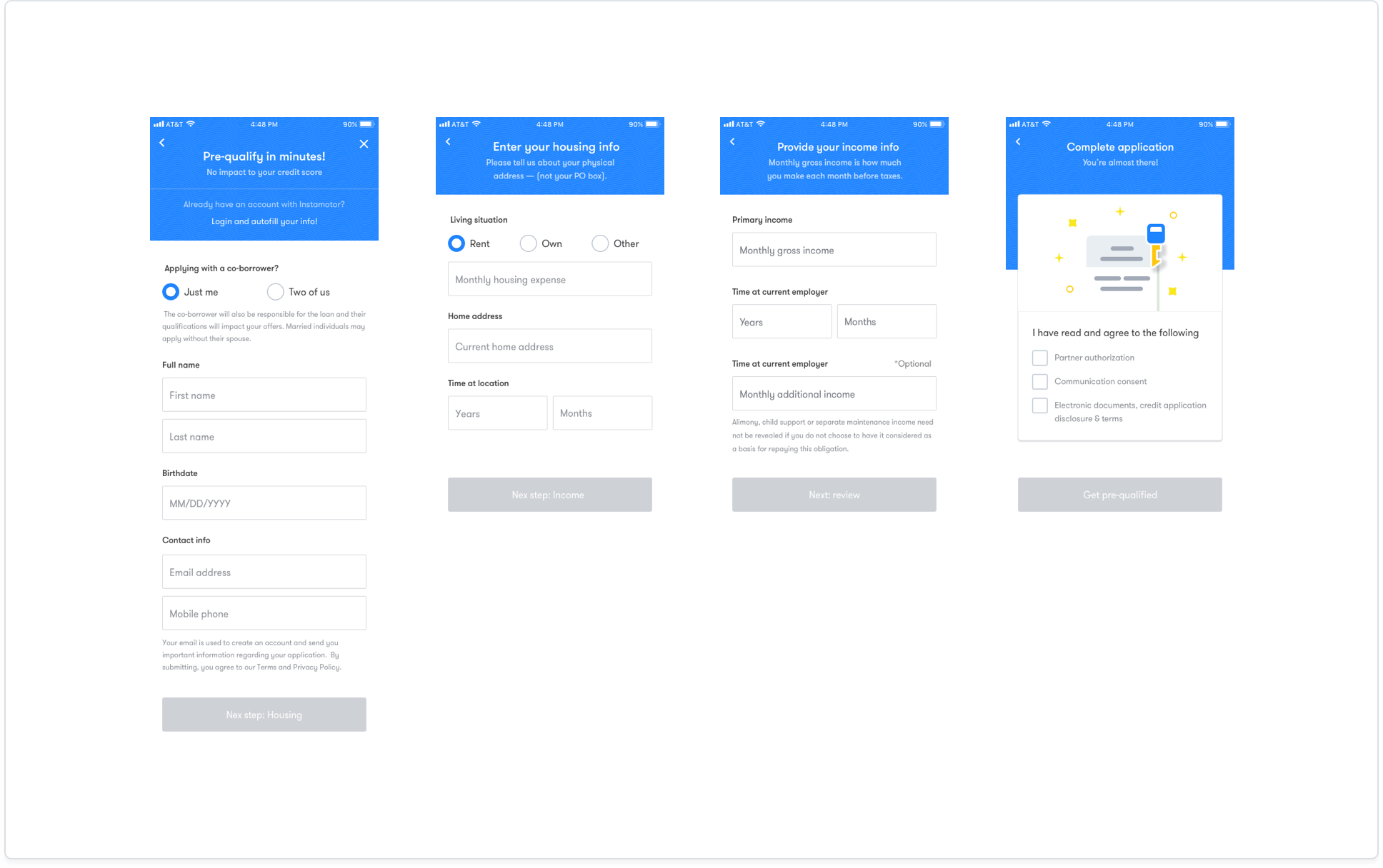
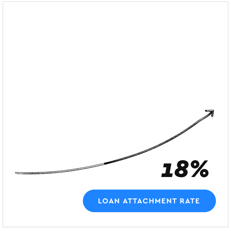
Measuring Results
After implementing our adjustments we were able to triple the number of users entering the application, but more notably bump our…

Takeaways
It was, of course, important to tackle these issues as a business objective, but even more important to ensure people were given proper education around financing, clarity to make informed purchase decisions, and a no-nonsense application process. After all, buying a car and getting finanicing can be stressful enough.
- Aim for low-hanging fruit. Quick fixes that yield greater returns.
- Close attention to messaging and education. Language as an interface.
- Understanding where individuals are in the 'buyer' journey and aligning information accordingly