Recent Work
Deeper dives on request.
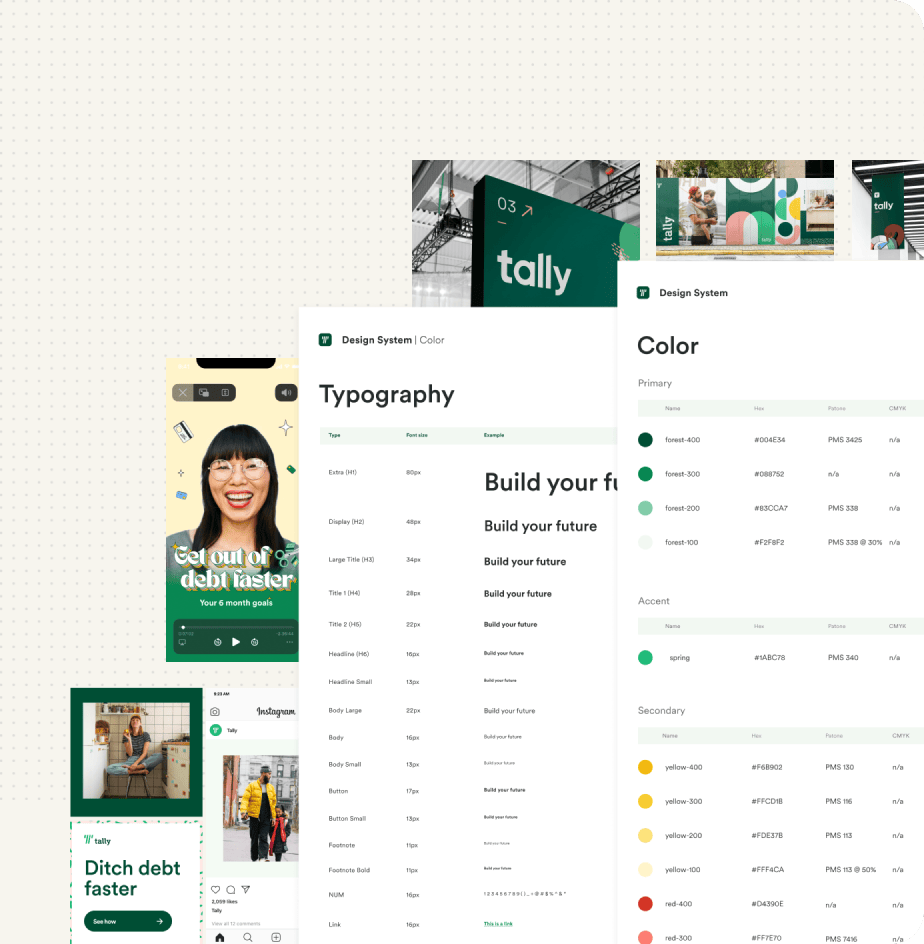
Driving co-ownership, building for efficiency, and unlocking scale
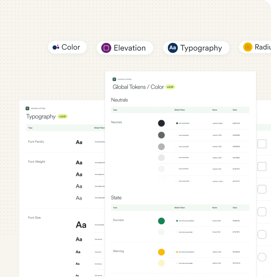
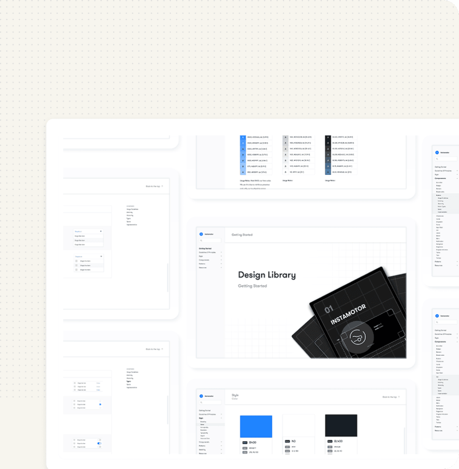
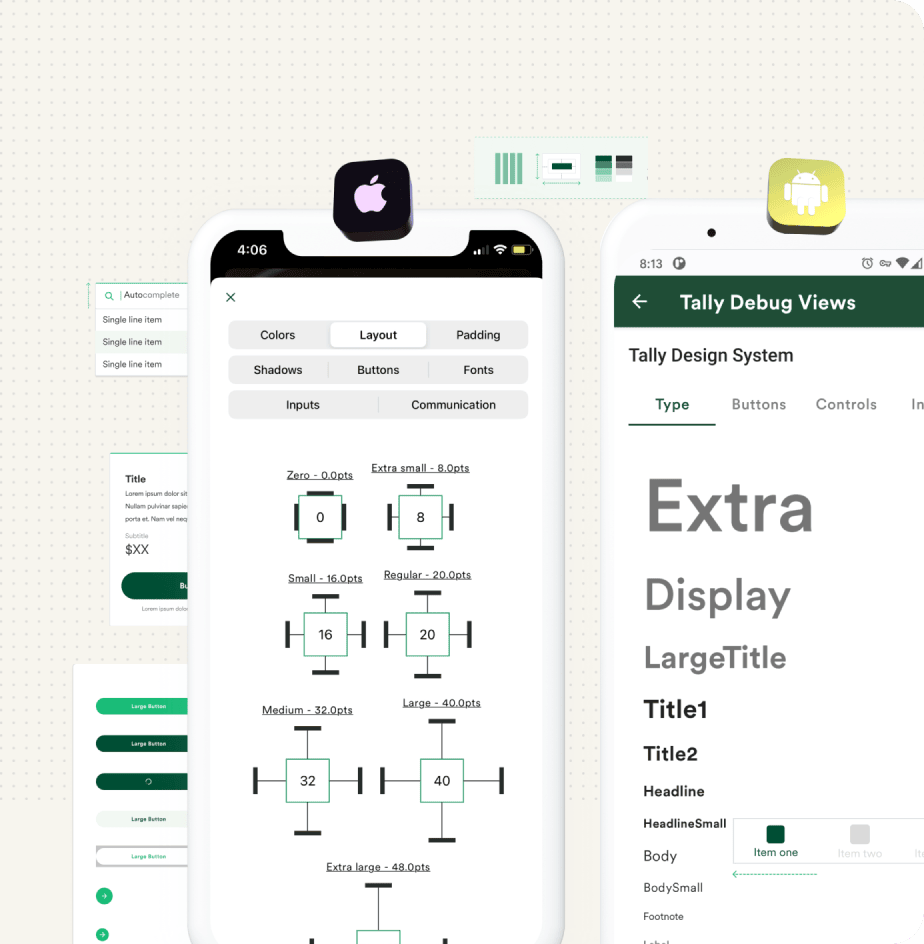
Laying foundations for a fully white-label SDK with a 0 to 1 design tokens system
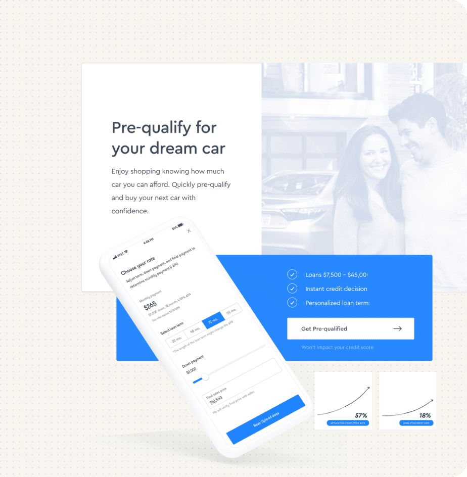
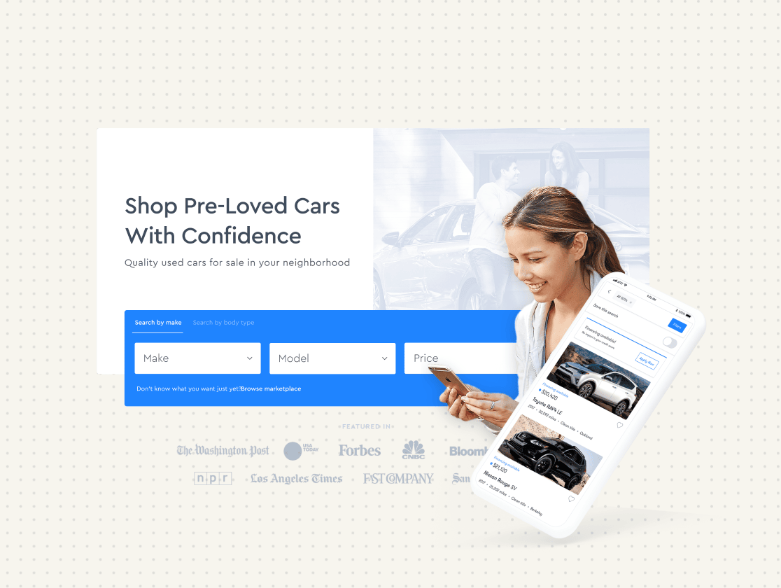
Rearchitecting our product from DTC to B2B2C— adapting the one to the many
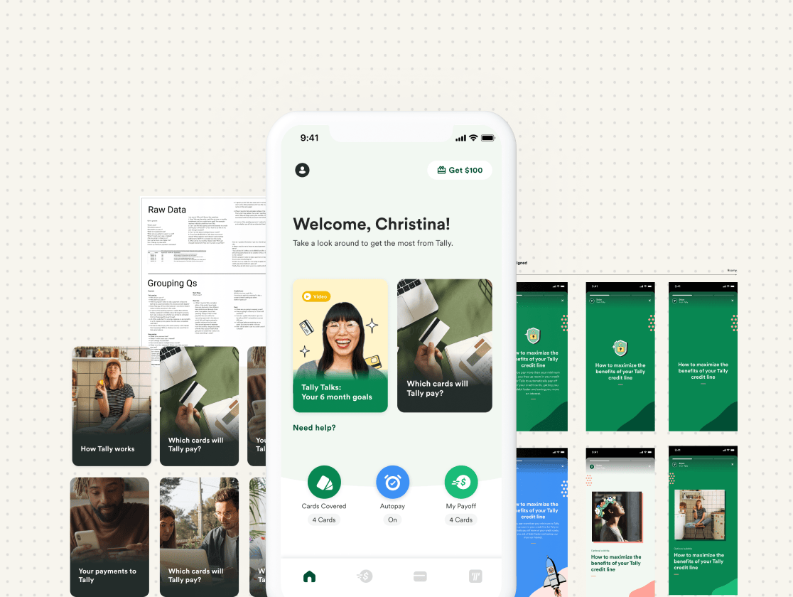
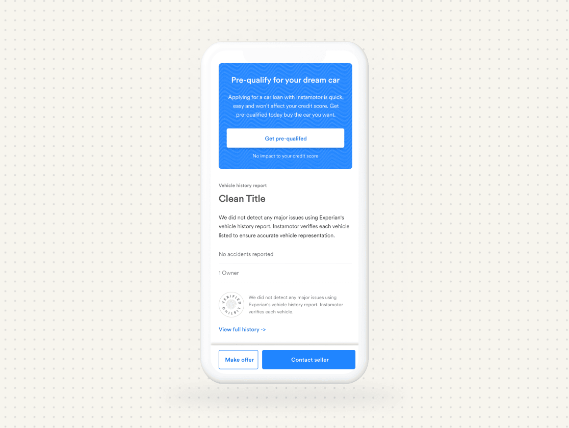
First-time UX, education and, reducing new borrower churn
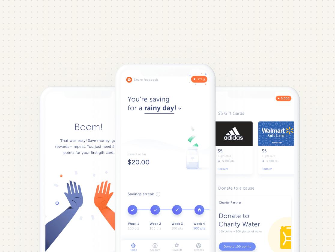
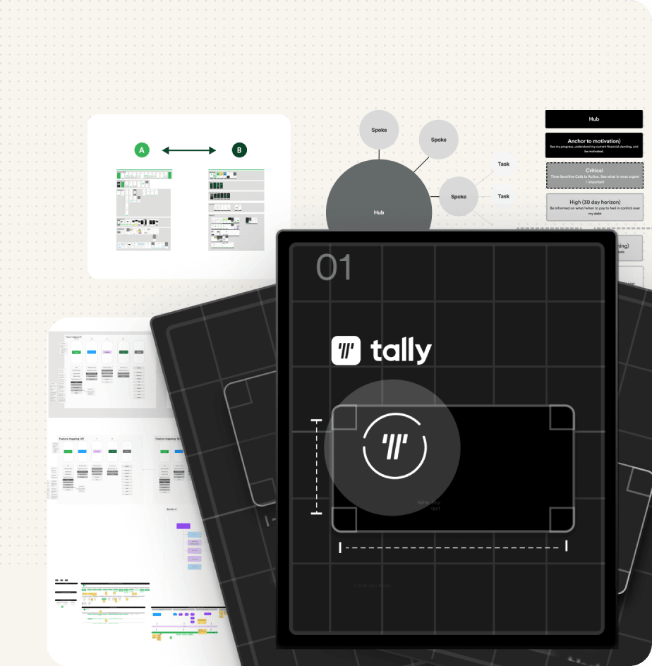
Pairing automation and rewards to drive healthy financial habits