Building Product Modularly
Company: Instamotor | 2018
Description: Rethinking our design operations and workflow
Growing Pains
In 2015 I joined Insamotor— a private-party car marketplace offering commission-free transactions, protection from fraud, and financing. As the first design hire on a small team we had a long road ahead of us; tasked to solve problems at an intersection of marketplace and fin-tech spaces.
We moved quickly and hacked our way to feature completion— though, at the cost of an inevitably messy process and a few cascading effects. Fast forward to today, poised to expand our markets nationwide and grow our team, we knew that how we operated achieved what we needed but didn’t lay a proper foundation moving forward.
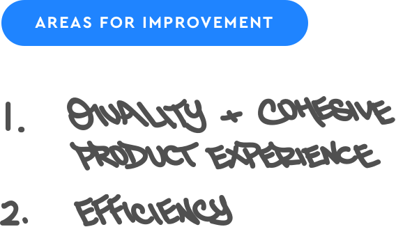
Our head of product led with a few initiatives and adjustments to workflow, and as a design team took this opportunity to stay proactive and re-evaluate our own process. We collected feedack across product and engineering teams, identifying two key areas we could improve on:
By iterating on our process, we could improve our output. But first, not without a few important guidelines: avoid attempting to solve every issue at once, install structure only where needed, and keep our ability to move quickly and adapt.
To establish a baseline we gathered feedback and took notes to mirror how engineering operated, with the intent to improve communication and collaboration across those teams.
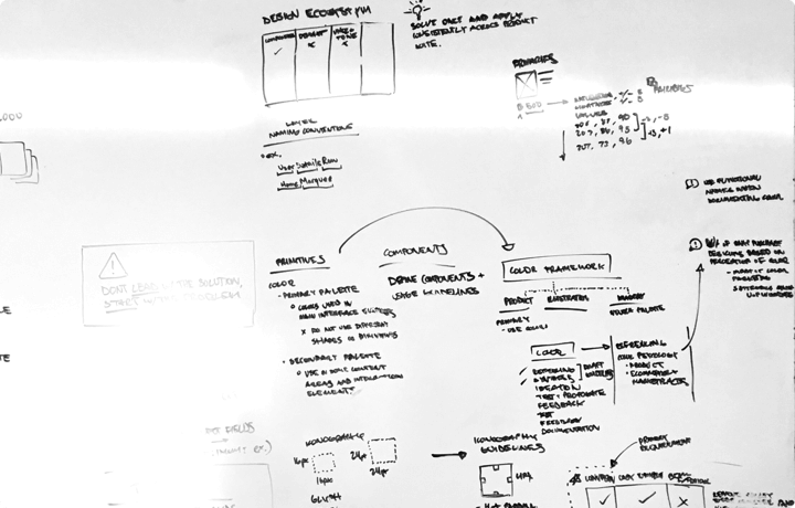
WHITEBOARDING
Special thanks to Alan for working together on this
'JUNE'
Does what doggos do
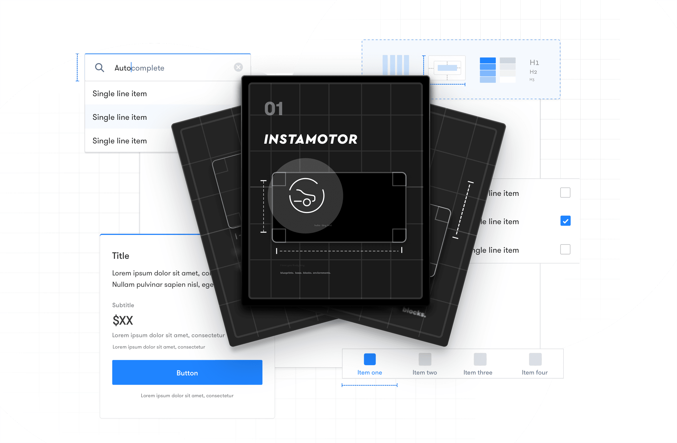
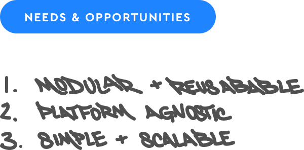
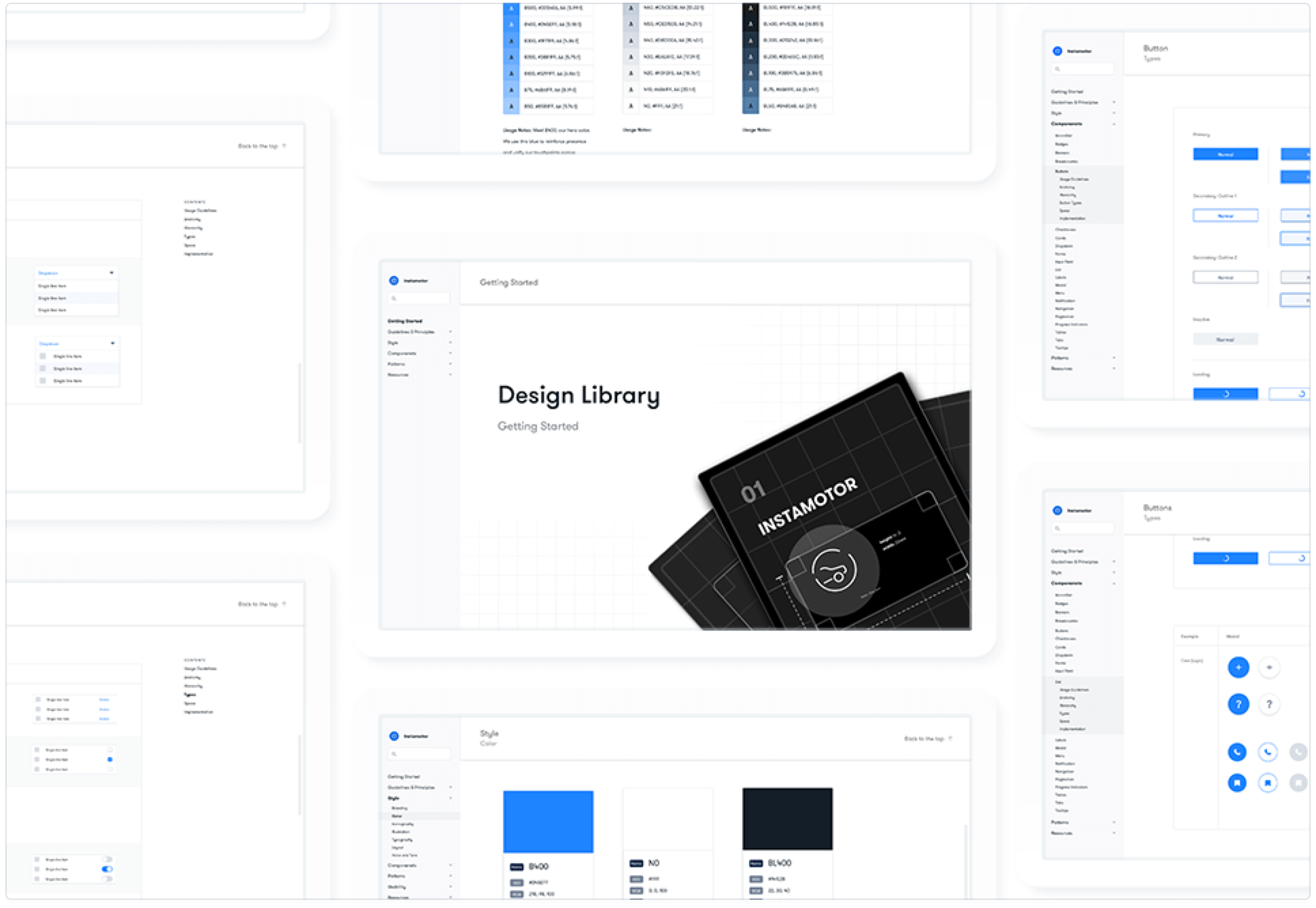
Standardization & Building Modularly
QUALITY & COHESION
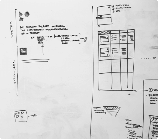
We drafted a version of Tim Van Damme’s Component Worfkflow, and modified it based on our needs. Using this hierarchy we could provide a cascading framework to lean on and standardize design without being too restrictive. It’s nothing inventive or novel but gave us just the right amount of structure 

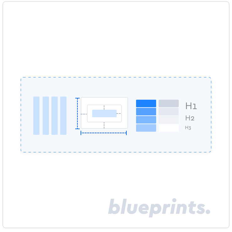
Blueprints
Core spec guidelines consisting of grid, spacing, color, type, etc.
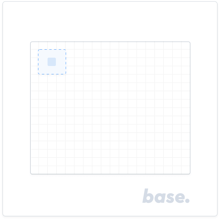
Base
Base elements (avatars, iconography, etc.) — basic components that inherit specs from it's parent category (Blueprints).
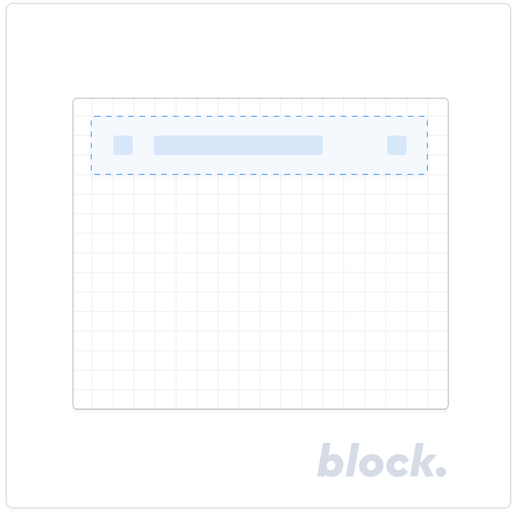
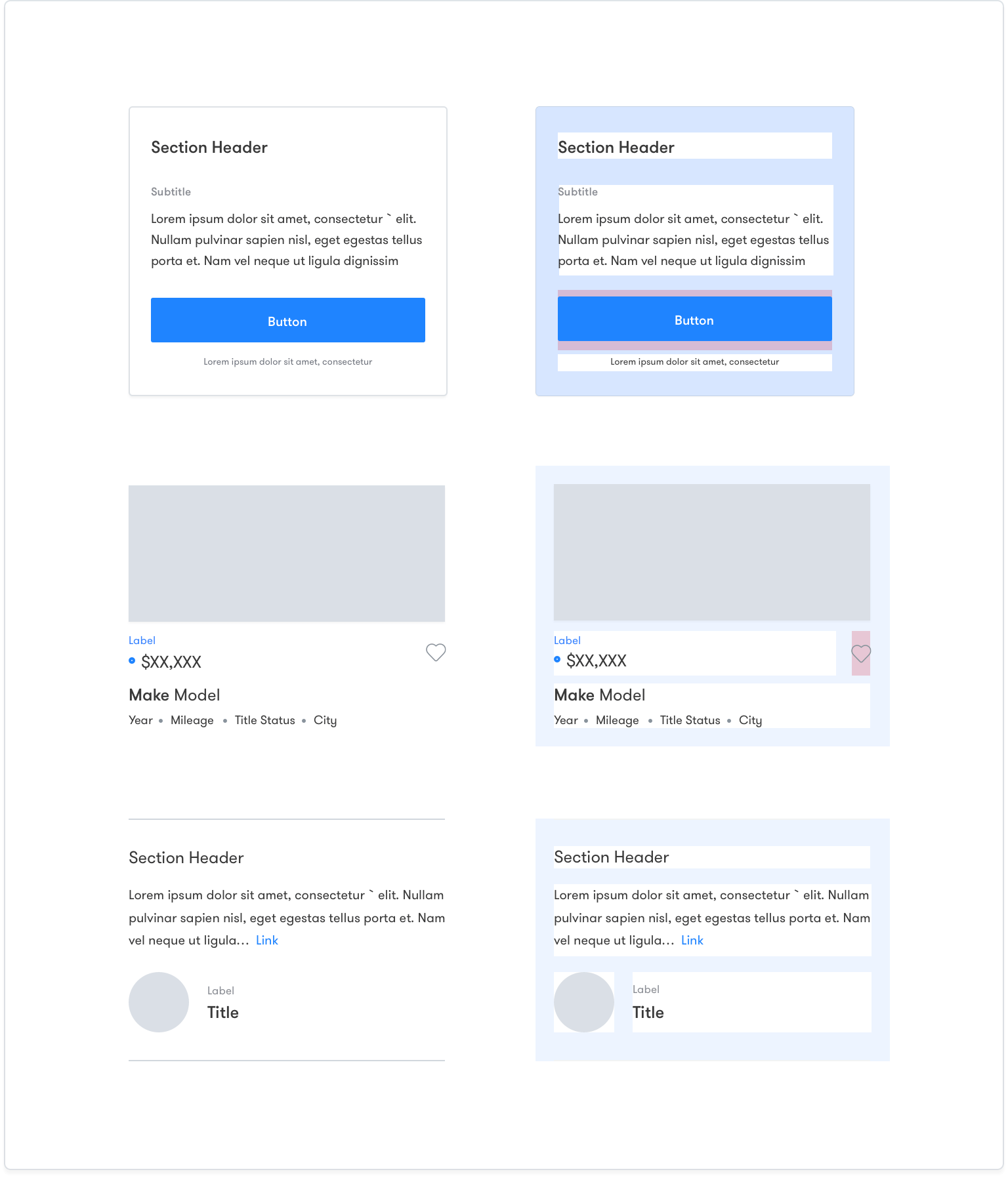
Block
Block elements (buttons, inputs, forms, cells, etc.) combined with base elements that inherit specs from its parent category.
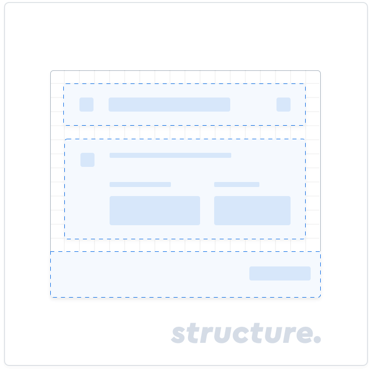
Structure
Structures (cards, modals, sidebars, menus, etc.) are composed of a combination of base and block elements.
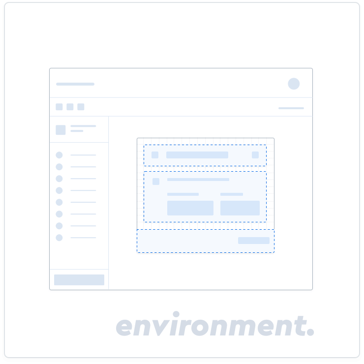
Environment
Environments (composed of blocks and structures) are the views these exist in.
